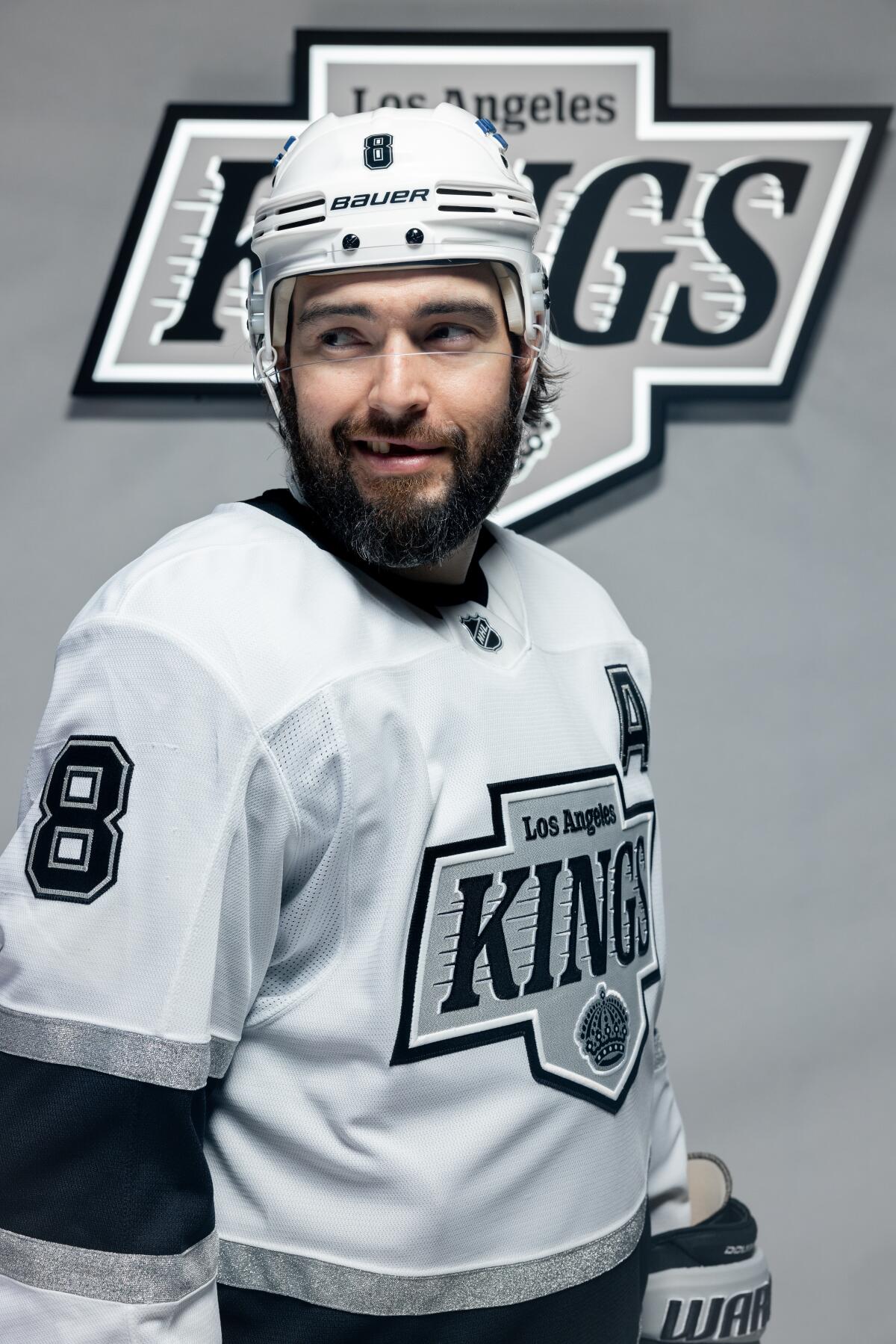
The Kings and Ducks are taking a look back while stepping into the future with new uniforms that were unveiled Wednesday.
Both teams revealed logos that harken to earlier days.
Yes, Ducks fans, that means the classic and ever-popular mask logo is back. More on that in a minute.
The Kings are going with a logo very similar to one they used from 1988 to 1998 — an era that overlapped with Wayne Gretzky’s time on the team (1988-1996).
The most prominent feature is the word “Kings” in bold letters in the middle of the logo, with speed lines running behind it, “Los Angeles” written above and at the bottom, a crown — an image that dates to the team’s initial season in 1967.

Drew Doughty wears the Kings’ road uniform for the 2024-25 season.
(Courtesty of Los Angeles Kings)
The elements are all outlined to form a crest shape, similar to the most recent logo, which was retired after being used since 2008.
“This evolution is rooted in our 57-year history and embraces the elements of our eras,” Kings President Luc Robitaille said in a statement. “It also involved interface and feedback with players both past and present, and it sets the stage for extensions and new iterations in the future.”
The team colors remain black, silver and white, although the palette has been updated to include a new “enhanced silver.”
The Ducks, however, are trying something different. Their new primary color is now orange, with black, white and gold worked in. But even that change is a nod to the team’s Orange County roots, Ducks owners Susan and Henry Samueli said in a statement.
“The Ducks are a symbol of Orange County, and our pivot to orange with an updated, iconic logo encompasses our past, present and future,” they said.
The new primary uniform is similar to an alternate jersey worn by the team since 2015. And, yes, it features a slightly updated version of the original, cartoonish and now retro-cool logo of a hockey mask shaped like a duck’s bill. The previous logo — a “D” shaped like a duck’s webbed foot — has been moved to the jersey’s shoulder.
The team has been tweeting videos of local celebrities being gifted the new jerseys and their approval of the new look.
“So that’s the new logo, huh?” Angels star Mike Trout said. “Wow. That’s sweet.”
Pittsburgh Pirates pitcher Paul Skenes, a Fullerton native who played at El Toro High, commented that orange is his favorite color.
“Sweet. Got the old hockey mask,” he said while looking at the logo. “Gonna have to come out to a game.”
